Matt Talbot
Brand Strategy
Logo & Tagline
About the Rebrand
Primarily known as a “soup kitchen,” Matt Talbot needed a way to let people know they’re about much more than food. They partnered with KidGlov to boldly refresh their brand and, in turn, gain awareness of their defeating homelessness initiative.
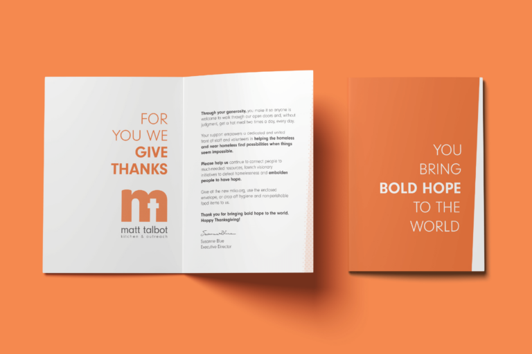
Using results from the Brand Advancement Process, KidGlov created a brand strategy that uses Matt Talbot’s new tagline, “Bold Hope,” at its core. The symbolically designed, bright orange logo makes Matt Talbot stand out while remaining faithful to their roots. This strong voice and visual identity are carried throughout a myriad of deliverables to generate awareness and positive energy in the community.
Deliverables
Brand Advancement Process
Logo/Tagline
Graphics Standards
Website
Television
Radio
Public Relations
Direct Mail
Vehicle Wrap

Bold Hope
Matt Talbot’s bold new brand authentically represents how they courageously help the homeless find possibilities when things seem impossible. After the rebrand and defeating homelessness initiative were launched at a packed press event, they received many kudos and front-page coverage.
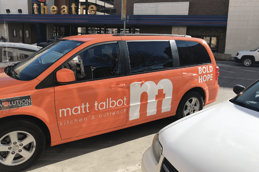
VEHICLE WRAP
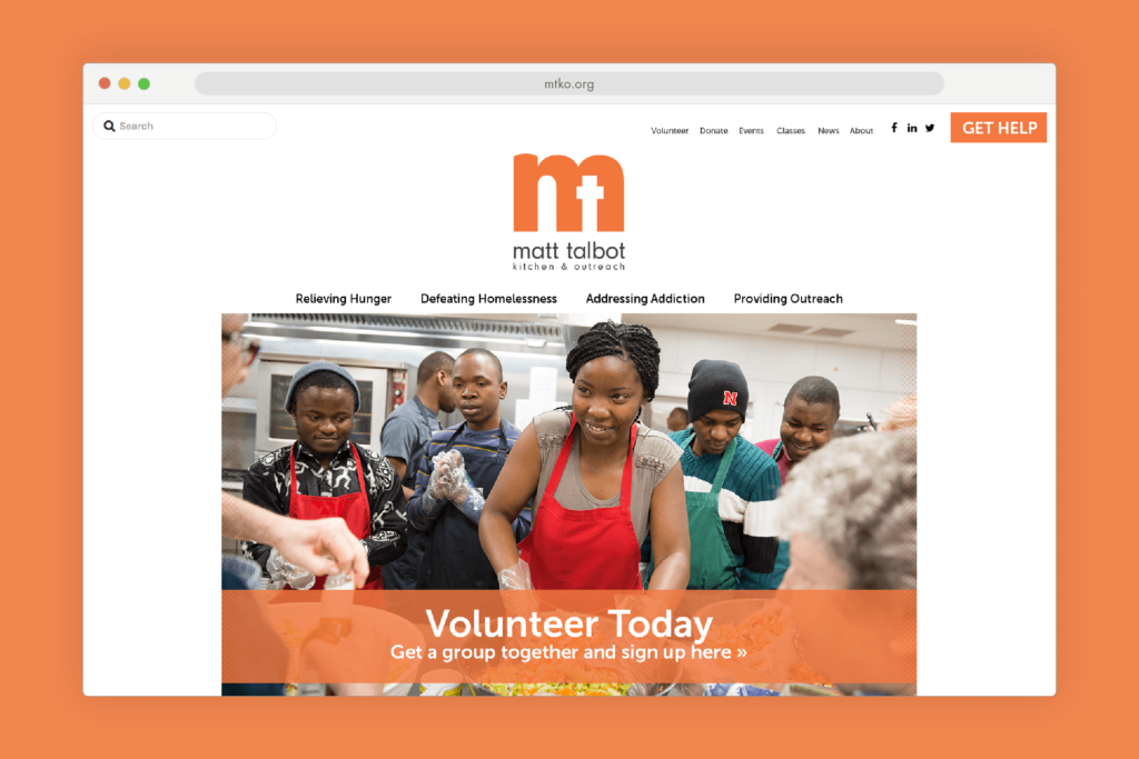
Website
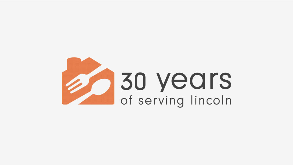
30-year Logo
KidGlov has done a great job of modernizing the Matt Talbot brand with an approach that really fits.