Jul. 28
October 19, 2022
The Meaning Behind Your Brand’s Color Choices
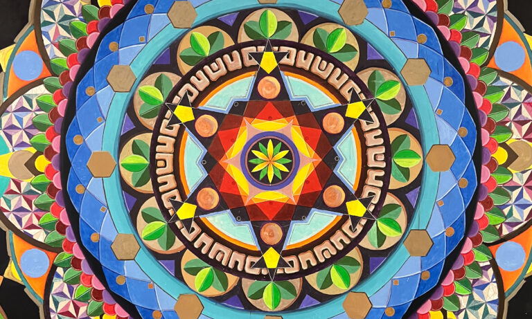
Color is such a big part of our sensory toolkit and helps us develop emotionally impactful campaigns. And that’s because there’s an energy and psychology to color, a meaning that drives us, even if we’re not completely conscious of it. Once you understand these meanings, you can harness the power of color to create more effective marketing. Below, I’ll discuss color theory, and then talk about three ways you can use color to amp up your brand.
Color Theory
In art class, you probably learned about the color wheel. It’s a graphic demonstration of the spectrum of colors. On this wheel, there are three primary colors: red, yellow, and blue; and three secondary colors: purple, green, and orange. Colors directly opposite each other on the wheel are known as complimentary colors. Placing these colors next to each other makes each one feel more vibrant and intense. From a psychological standpoint, pairing complimentary colors can create a balance between the calm serenity of cool colors and the excitement of warm colors, creating a feeling of harmony. Colors that are next to each other on the wheel are neighboring colors and are very harmonious when paired together.
1. The Energy of Color
All colors carry what they call electromagnetic energy. That means our brains and endocrine systems absorb the energy from colors and inspire us to feel or act in certain ways. This effect is illustrated by our different responses to warm and cool colors.
2. Psychology and Physiology of Color
Reds, oranges and yellows are known as warm colors because they are associated with heat and warmth like the Sun or embers in a fire. They can induce feelings of comfort and happiness and are often used for food brands and restaurants. Red is recognized as the most stimulating of colors and has been known to increase appetite. These hot, bright colors can also create a sense of energy and urgency. When used sparingly, like in ads or websites, hot colors can draw attention to key messages requiring action. On the flip side, industries like finance, medical, and airlines avoid using the color red due to the association with emotions such as fear, caution and danger.
Blues, greens and violets, on the other hand, are known as cool colors, because they have a cooling or soothing effect. Cool colors calm the body and the mind, bringing serenity, balance and relaxation. It’s not surprising that these are popular colors for branding of spas, resorts, even physicians’ offices and human service organizations. Cool colors like (such as blue) can invoke feelings of trust, security and confidence, and are perfect for banks and other financial institutions.
3. Pantone: Sources of Color Inspiration
For sources of color inspiration, look no further than the creative’s color bible: Pantone. The Pantone Color Institute created the most important universal color matching system in the world in 1963. Since then, it is the easiest way to classify, communicate and match colors. To see what colors are available, you can use large color books or flip charts, or more recently, an online app that provides thousands upon thousands of color options.
Every Pantone color is assigned a specific number to identify it. And that same number is used across the board universally for paint, plastic and fabric manufacturers. Pantone is literally the universal library of color. And here’s a fun side note: if you go to the Pantone website, you can use their free color trend reports to see what colors and trends will emerge months in advance. Some marketing campaigns need to start well over a year ahead of time, and these trend reports offer great insights that you can use for inspiration.
In the year 2000, Pantone introduced the Pantone Color of the Year, which is a trend-setting concept that every industry creative anticipates, from interior design and fashion, to product design and branding. The 2022 Color of the Year is Very Peri. Pantone is very intentional about the meaning behind each of these colors. Here’s what they had to say about this year’s color: “Very Peri is a symbol of the global zeitgeist of the moment and the transition we are going through. As we emerge from an intense period of isolation, our notions and standards are changing, and our physical and digital lives have merged in new ways.”
The Color of the Year is perfect for seasonal campaigns and product designs with shorter use cases, but I wouldn’t recommend changing your logo or brand colors annually to fit with the Color of the Year. But if you do use it, because the color of the year is such a large trend in the market, you should hashtag any campaign post when you are using the color for added exposure. It’s a great way to let your audience know you are paying attention to trends in the market.
Finding the Colors That Fit Your Brand
Hopefully, I’ve given you some great resources for choosing the right color for your brand, as well as how and why each color may be a good fit. However, if you find yourself drowning in Pantone books and color choices, we’re just a phone call away. We’d love to help you curate the right look and feel for your organization.
For more new perspectives, explore our other blog posts and Agency for Change podcast episodes featuring leaders who are creating positive change in the world.
KidGlov is a boutique, full-service, advertising, branding and content marketing agency and certified B Corp, with offices in Omaha and Lincoln, Nebraska, specializing in nonprofit marketing, healthcare marketing, financial marketing, social impact marketing, and purpose-driven businesses.