Farmers & Merchants Bank
Website Redesign

One Muddled Message
Farmers & Merchants Bank prides themselves on being the hometown bank with big bank perks. Their outdated website, however, didn’t communicate that message clearly through the copy and the design, plus it didn’t feel warm and welcoming like their established brand.
The bank needed a new website that showcased the top-of-the-line products and services they offer and showed how people are at the forefront of what they do and why they do it. Striking the balance between the two was the key to success.
They called on KidGlov to redesign their website to turn this muddled message into a crystal clear one — We’re your hometown bank.
Deliverables
Complete visual redesign, while adhering to Farmers & Merchants Bank brand standards
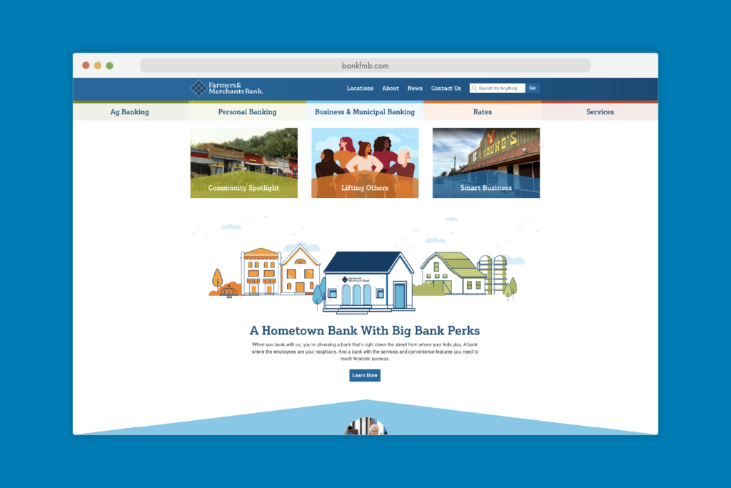
Efficient site structure for ease of navigation and discovery
Easy access to online banking for all users
User experience overhaul, including the blog content

A Bank for the People
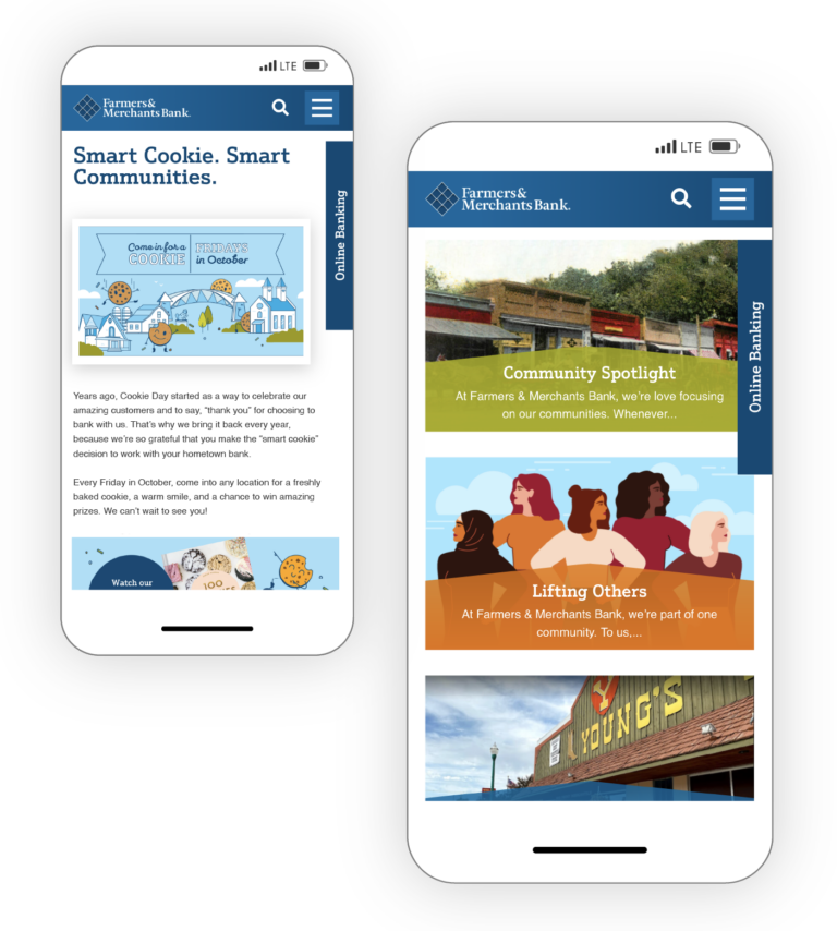
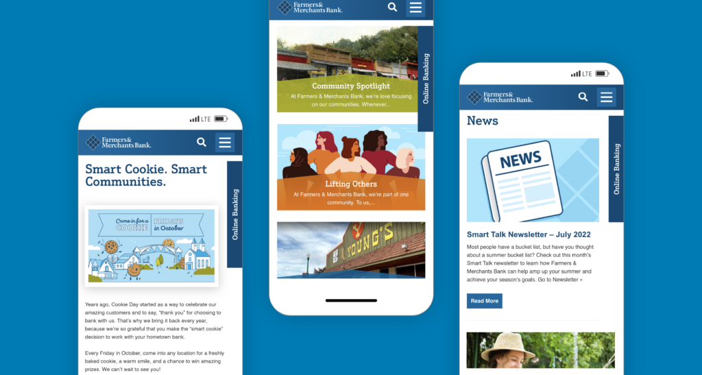
The new website caters to potential and current customers and provides efficient access to the online banking login, services pages, and rates. The decision to use real images of the bank staff and customers was a no-brainer and it truly sets the tone for the website, from the moment you land on the homepage.
No matter where you are on the site, there is no doubting who Farmers & Merchants Bank is, what they stand for, and what they value most.
This new website is exactly what the bank needed. Now it tells our story, shares our products and services, and most importantly helps our customers find what they need. That’s truly the best outcome.
