St. Monica’s
Brand Takes Flight
About the Rebrand
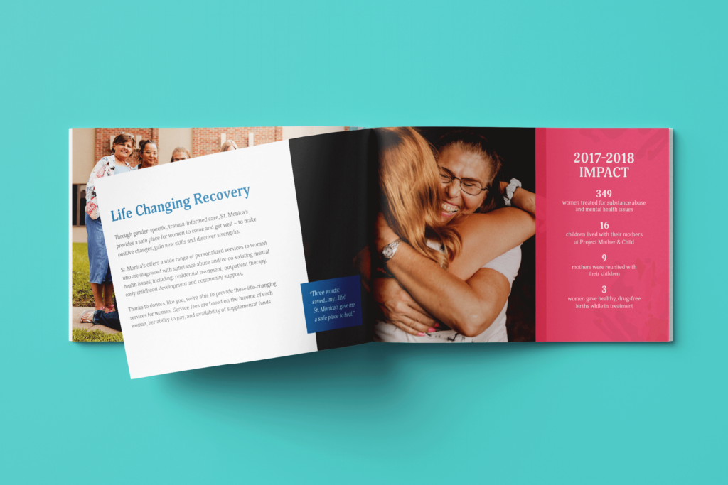
Empowering women to feel they are worth their recovery is what St. Monica’s is all about. They help women in the Lincoln community be the best they can be for today and moving forward.
In tribute to their success helping women for over 50 years, St. Monica’s decided to give their organization some fresh wings for the future through a colorful rebrand.
Deliverables
BRAND ADVANCEMENT PROCESS
IDENTITY
WEBSITE
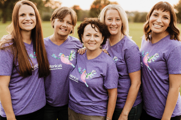
T-shirt design
Print materials
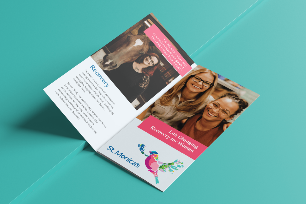
Brochure
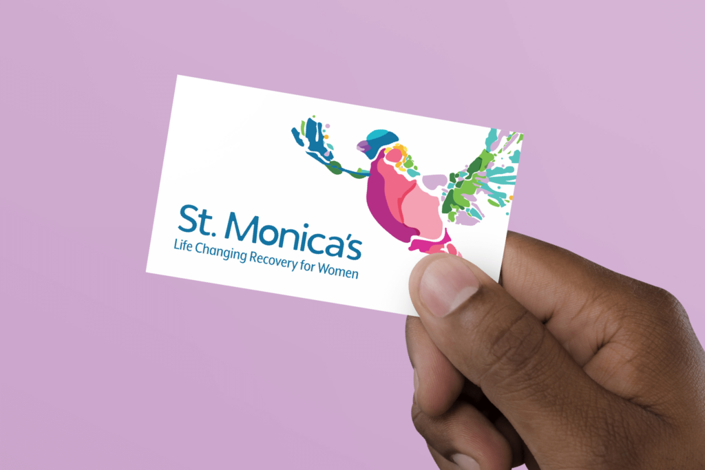
Business Card
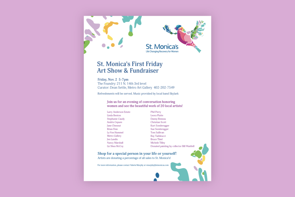
Flyer Template
Annual Report
Brand Takes Flight
KidGlov’s Brand Advancement Process inspired a brand strategy that exemplifies how St. Monica’s provides a safe place for women to come and get well – to make positive changes, gain new skills and discover strengths.
Brand messaging was created using the interplay of St. Monica’s brand archetypes (caregiver, lover and ruler) to appeal to women they serve, supporters and staff.
“Life Changing Recovery for Women” became the new tagline and a soaring, spirited new logo was crafted to really make this brand take flight.
The rebrand represents how St. Monica’s team of passionate, caring women help other women to overcome some of life’s most challenging struggles, helping them live better, healthier lives.