The Well
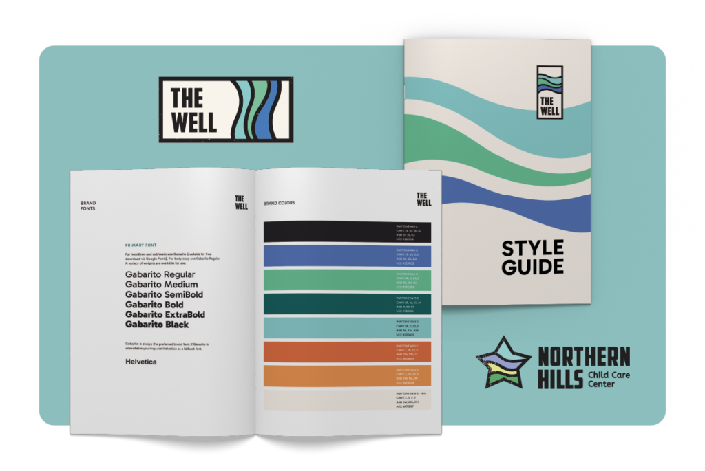
A New & Inclusive Brand
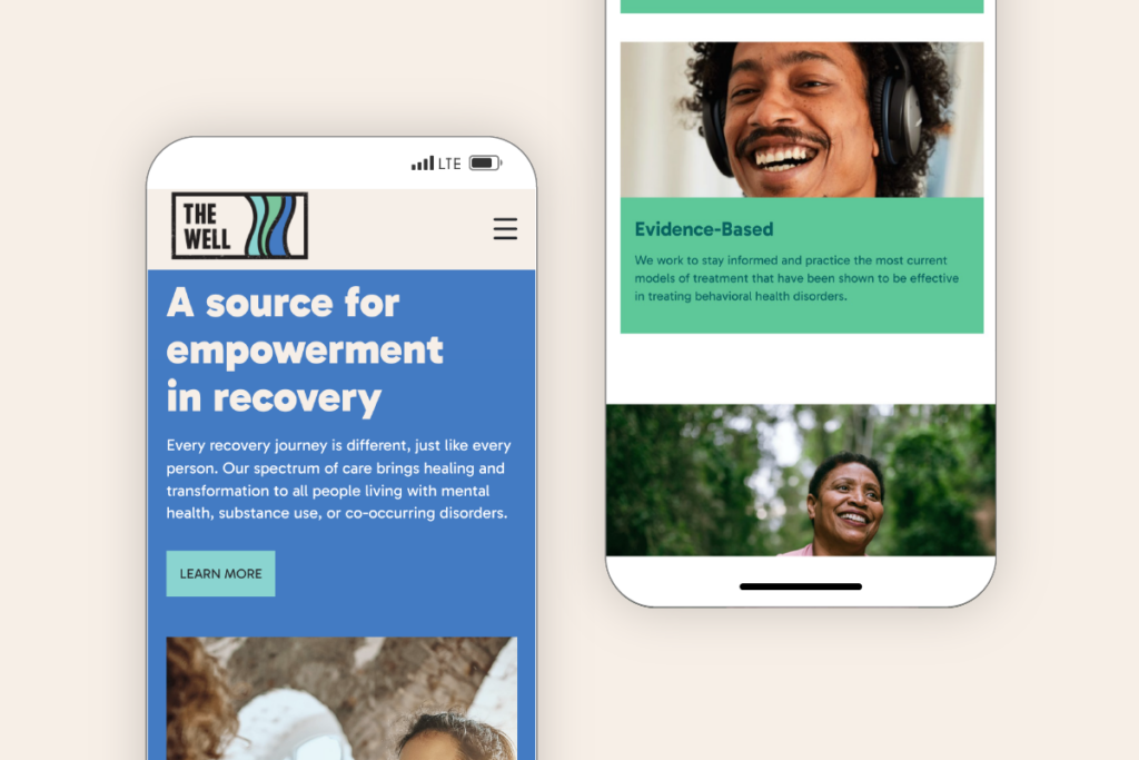
Mobile Responsive
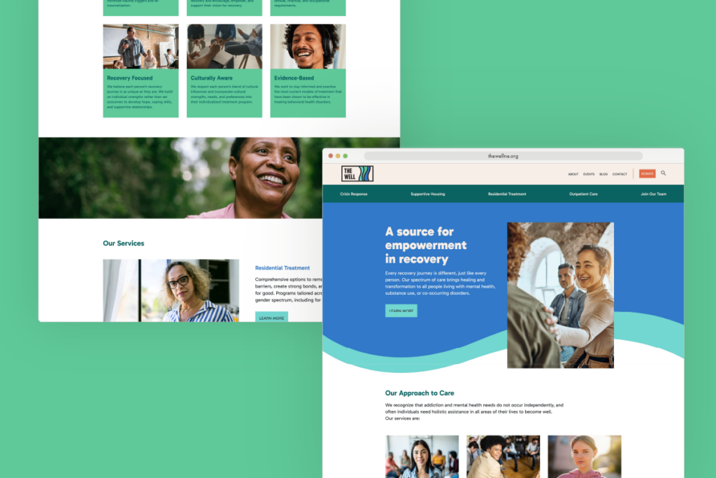
Refreshed Website
Recovery For All
Women’s Empowering Life Line built their reputation on designing holistic treatment programs specifically for women in recovery. It made sense that their name and brand were female-focused — down to the pink logo. Then they added men to their mission. Neither their name nor their brand fit their new identity.
To reflect their expanded mission, Women’s Empowering Life Line needed a name and brand inclusive of men and women. We also wanted to honor their story and preserve their past — as a trusted, valued community resource with a proven record, long history, and deep passion for providing transformational care.
Deliverables
Logo
Tagline
Supporting Organization Logo
Style Guide
Elevator Pitch
Messaging
Website
Well, Meet The Well
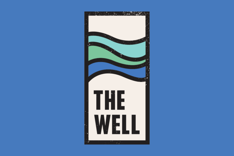
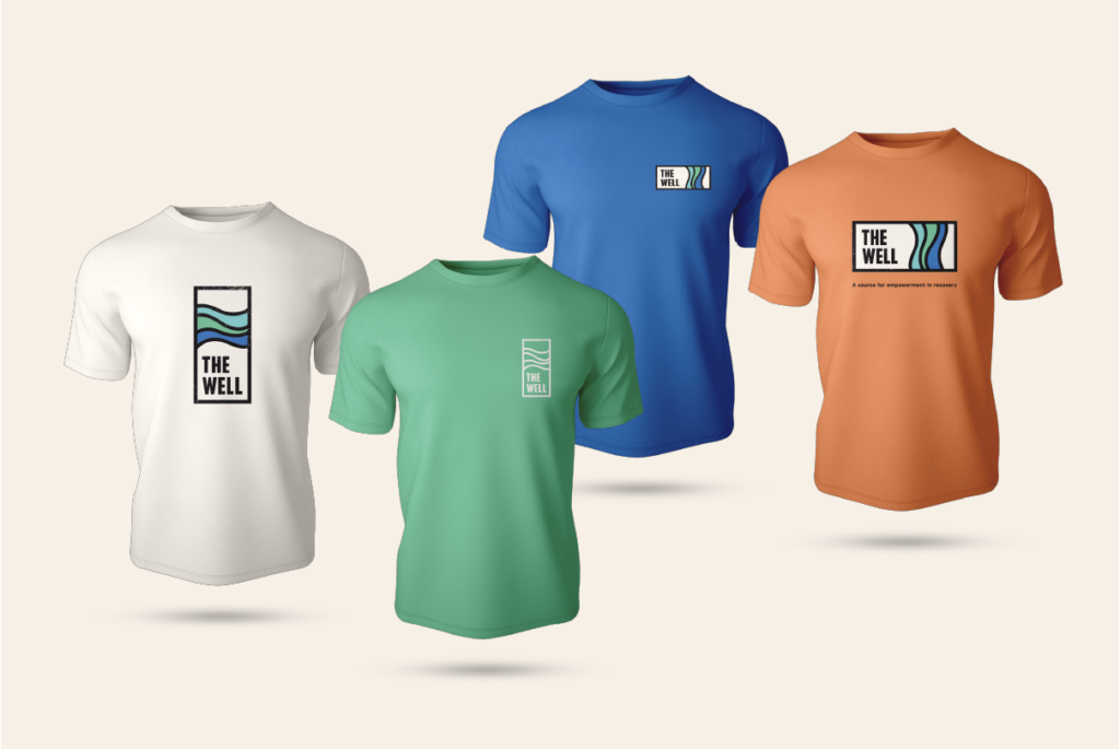
We didn’t have to go far for a name that transcended past, present, and future. We embraced the acronym they were already known by — W.E.L.L. — and formalized the name in a way that attached deeper significance to its meaning. “The Well” is a place, and the name symbolizes healing. Their new tagline, “A source for empowerment in recovery,” clearly and succinctly underscores their mission.
To complete The Well’s new identity, KidGlov created a logo balancing masculine and feminine — representing inclusivity for all. Stylistically it’s bold yet friendly and was thoughtfully designed with trauma-informed shapes and colors soothing to those going through challenging times. This feel is translated to the new website, which invites visitors into a calming, welcoming space.
Getting to work with KidGlov two times within my career has been such a treat. I'm so grateful for their creativity and guidance on this new brand and website launch that has transformed Women's Empowering Life Line to The Well!